Loyalty Program KPIs and Benchmarks by Vertical and Program Maturity
Published by Clutch | Updated July 2026
There is no single universal loyalty benchmark. The right target for enrollment, activation, redemption, and ROI depends on your vertical, purchase cadence, program maturity, and how you identify and measure customers.
Ask ten loyalty leaders what a "good" enrollment or redemption rate looks like, and most of their answers will be right — for their business. A grocery chain where members shop weekly needs a different active-member window than a furniture retailer whose customers buy once every few years. This guide replaces the search for one universal number with a framework: what to track, how to calculate it, and what to do when performance is weak — organized by vertical and by program maturity.
In this guide, a "benchmark" may be an activity window, a maturity-stage expectation, an internal baseline, or a comparison against a matched cohort — not necessarily a universal percentage. Where a verified industry percentage exists, we cite it; where it doesn't, we give you the method to set your own.
Executive summary
What loyalty benchmarks measure: how well a brand identifies customers, converts them into active members, changes their purchasing behavior, and turns that behavior into incremental profit.
Why there is no universal benchmark: purchase cadence, reward structure, identification method, and program age all change what a healthy number looks like.
Four performance categories every program should track: identification and enrollment (can you recognize and reach the customer?), activation and engagement (are members using the value?), customer behavior (is the program changing how they shop?), and financial performance (is it creating incremental profit?).
The takeaway for executives: enrollment counts members; it doesn't prove the program works. Program strength is measured by activation, behavioral lift, and incremental gross profit — against your own baseline and your program's maturity stage, not a generic industry number.
Key loyalty terms at a glance
- Enrollment conversion rate — the share of eligible, invited customers who complete loyalty sign-up. Shortened to "enrollment rate" in casual usage; this article uses the precise term throughout.
- Identified transaction rate — the share of transactions connected to a known customer profile.
- Active-member rate — the share of enrolled members who purchased within an activity window matched to normal purchase cadence.
- Redemption rate — the share of issued reward value that members actually use.
- Incremental loyalty lift — the portion of member behavior a control or holdout comparison shows was caused by the program, not by self-selection.
- Program ROI — the return remaining after total program costs (rewards, communications, and technology) are subtracted from incremental gross profit, divided by total program cost.
Benchmark matrix by vertical
This table is the fastest way to orient a new program: match your vertical to a starting activity window and primary KPI, then confirm the window against your own purchase data using the program maturity framework below.
How to use this framework
Apply this framework in five steps:
- Define your purchase cadence from your own transaction data.
- Select an activity window using the benchmark matrix above as a starting point, not a fixed rule.
- Determine your program's maturity stage using the program maturity framework to know which KPIs should lead.
- Find the weakest lifecycle stage using the lifecycle scorecard.
- Measure incremental improvement with a control or holdout comparison before crediting the program — see redemption and incrementality below.
Pick two or three actions targeting the weakest stage, run them for 90 days, and review monthly.
What are the most important loyalty program KPIs?
Loyalty KPIs fall into four categories that mirror the customer journey: a customer is identified, then enrolled, becomes contactable, then active, then — ideally — a repeat, profitable customer.
Below are full definitions for the six KPIs leadership teams ask about most. Additional KPIs — visit-frequency lift, AOV lift, and time to first redemption — appear in the table further down with formulas.
Identified transaction rate
Formula: Identified transactions ÷ total eligible transactions
Why it matters: Every other KPI in this article depends on connecting a transaction to a customer profile first.
Common mistake: Treating this as the same metric as enrollment — see enrollment versus identification below.
If it's weak: Test phone-number or card-linked identification, which needs fewer steps than app-based enrollment.
Enrollment conversion rate
Formula: Customers completing enrollment ÷ eligible customers invited to enroll
Why it matters: It's a volume metric — the first checkpoint toward a contactable, measurable customer base.
Common mistake: Reporting cumulative enrollment as if it were a health metric, without checking downstream activation.
If it's weak: Reduce required fields, allow phone-number-only signup, and add a first-purchase incentive.
Contactable-member rate
Formula: Contactable enrolled members ÷ total enrolled members
Why it matters: A large member database has limited value if the brand can't reach members between visits.
Common mistake: Assuming every enrolled member is contactable — consent is often captured separately and can lapse.
If it's weak: Add an explicit opt-in step at enrollment and a re-permission campaign for invalid contacts.
Active-member rate
Formula: Members transacting in the activity window ÷ total enrolled members
Why it matters: It separates a real customer base from a list of names — the most misused KPI because the "right" window changes by vertical.
Common mistake: Applying one active-member window across verticals with different purchase cadences (see the benchmark matrix above).
If it's weak: Segment by cohort and location to find where activation breaks down, then target lifecycle triggers there.
Incremental gross profit
Formula: Incremental revenue × contribution margin rate. One practical calculation for visit-driven programs: incremental visits × average gross margin per visit — this simpler version works well when frequency is the main lever, but a program that mainly lifts basket size, category penetration, or margin mix needs the fuller revenue-based formula instead.
Why it matters: This is the number finance teams need — what the program caused, not just what members bought.
Common mistake: Substituting total member revenue for incremental gross profit, or assuming only incremental trips count when AOV lift is the real driver.
If it's weak: Re-examine reward economics by segment — the costliest rewards may go to customers who'd have returned anyway.
Program ROI
Formula: (Incremental gross profit − total program cost) ÷ total program cost
Why it matters: The single number that lets leadership compare the loyalty program to other investments.
Common mistake: Calculating ROI from attributed revenue instead of incremental gross profit, which overstates return.
If it's weak: Look at reward-cost efficiency by segment before cutting program scope.
Additional KPIs with formulas
Recommended operating framework: Enrollment is a volume metric. Activation, behavioral lift, and incremental profit are value metrics. A report that leads with enrollment growth and buries incrementality is measuring the wrong thing first.
What is the difference between enrollment and identified transaction rate?
Enrollment and identification are related but distinct — conflating them is the most common measurement mistake in loyalty reporting. Enrollment is not the share of transactions tied to members. It is the share of eligible customers who joined the program.
A brand can have a large loyalty database and still struggle to influence behavior if members aren't identified at purchase or reachable between visits. Track these stages separately: identified → enrolled → contactable → transacting → redeeming → retained. A gap between any two stages points to a specific, fixable problem.
How should loyalty benchmarks change by program maturity?
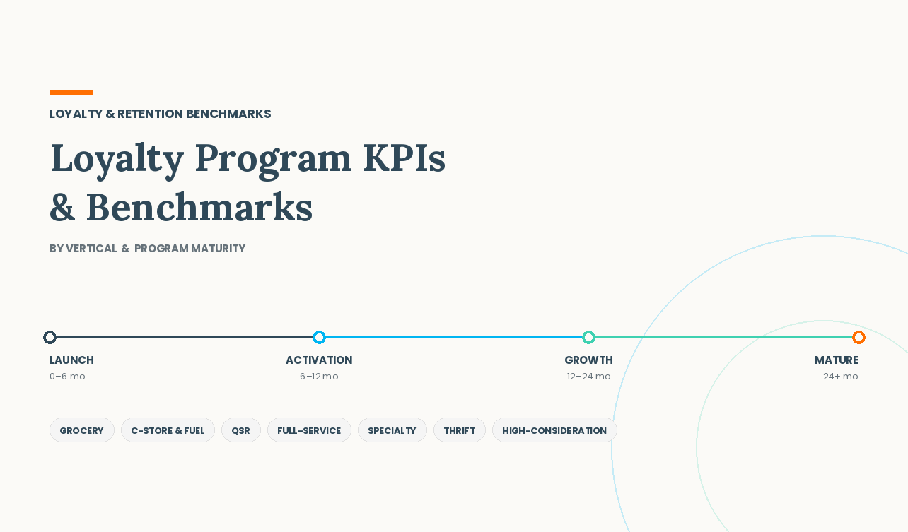
What "good" looks like changes as a program ages. The stage boundaries below are directional — actual timelines shift by vertical and how quickly the program reaches meaningful volume.
Do loyalty benchmarks change by vertical?
Yes — purchase cadence is the biggest driver of which KPIs matter and what activity window defines an "active" member. None of the ranges below are universal; use the benchmark matrix above as your starting point and calibrate to your own purchase-frequency data.
Grocery and pharmacy (weekly cadence)
Primary KPIs: identified sales share, active-household rate, weekly/monthly spend, personalized-offer redemption.
What improvement looks like: a rising share of identified baskets and shortening gaps between household visits, without a corresponding drop in reward margin.
Recommended triggers: early at-risk alerts (households quiet for 2+ weeks) and category-specific replenishment reminders.
Convenience and fuel (frequent, cross-category)
Primary KPIs: trips per member, fuel-to-store conversion, inside-store basket attachment, gallons per identified customer.
What improvement looks like: a rising share of fuel-only customers who also buy inside the store, and identification happening at the pump rather than only at the register.
Industry research: Inside-store sales generate a disproportionate share of convenience-industry gross profit relative to their share of revenue. Per NACS 2025 State of the Industry data, fuel represented roughly 65% of total sales dollars but only about 39% of gross profit dollars industry-wide, with foodservice alone contributing 28.5% of inside sales and 38.9% of inside gross profit. This is why inside-basket attachment often matters more than fuel volume alone. Source: NACS, "U.S. Convenience In-Store Sales Top $340 Billion" (April 2026).
QSR and fast casual (several visits per month)
Primary KPIs: identified order rate, visit frequency, time to second visit, reward redemption.
What improvement looks like: shortening time between first and second visit, and rising identification across both counter and digital channels — app share alone isn't a complete measure, since phone-lookup and payment-linked identification also count.
Full-service restaurant (lower frequency, larger checks)
Primary KPIs: time between visits, member check premium, at-risk guest reactivation.
What improvement looks like: members returning for a second occasion type (e.g., a lunch guest also booking dinner), and reactivation before a full year of inactivity.
Specialty retail (multi-month cycles)
Primary KPIs: 6–12 month active-member rate, repeat-purchase rate, lifetime value, category expansion.
What improvement looks like: members making their next purchase sooner than their historical average, or exploring an adjacent category.
Thrift and nonprofit retail (frequent, inventory-driven)
Primary KPIs: identified transaction rate, enrollment conversion rate, contactable-member rate, spend per visit.
What improvement looks like: rising identification at the register and growing SMS opt-in supporting new-inventory alerts. Location-level benchmarking matters more here than in most verticals, since employee participation and store traffic create wide store-to-store variance.
High-consideration retail, including furniture (annual or multi-year cadence)
Primary KPIs: long-window active-member rate, lifetime value, category/room expansion within a household.
What improvement looks like: a customer expanding into a second room or category, or a shortened gap between a first purchase and a follow-on purchase.
What is a good redemption rate, and how much more do members really spend?
Redemption
A good redemption rate shows members can earn and use meaningful value while preserving program economics. There's no single percentage that applies across every reward structure — redemption depends on whether rewards are points or cashback, automatic or activated, and how easily they can be earned and used.
Recommended operating framework: Maximum redemption is not the goal. A very high rate can mean the brand is broadly discounting purchases customers would have made anyway. Evaluate redemption alongside incremental visits, reward cost, and margin — the goal is profitable, incremental behavior.
Member spend premium vs. incremental lift
Members often spend more than non-members — but the full gap shouldn't automatically be credited to the program. Customers who already prefer a brand are more likely to enroll in the first place (self-selection bias). A member group spending 20% more than anonymous customers doesn't necessarily mean the program created a 20% lift; some of that gap reflects who chose to join.
Recommended methods to isolate incremental lift: matched controls, holdout groups, pre/post-enrollment comparisons, cohort analysis, location tests, and campaign control groups. Correlation between membership and higher spend is a useful starting signal — it is not, by itself, proof the program caused the difference.
How should brands calculate loyalty program ROI?
Loyalty ROI should be based on incremental gross profit, not attributed revenue alone — revenue connected to a member's account isn't automatically revenue the program caused.
Incremental gross profit: Incremental revenue × contribution margin rate. One practical calculation for visit-driven programs — use this simpler version when frequency is the program's main lever: incremental visits × average gross margin per visit. Programs that create value mainly through AOV lift, category expansion, or margin mix should use the fuller revenue-based formula instead.
Total program cost: Reward cost + communication cost + technology and operating cost
Program ROI: (Incremental gross profit − total program cost) ÷ total program cost
Value per active member: (Incremental gross profit − total program cost) ÷ total active members
Calculate these by cohort, location, reward type, and time since enrollment — a single company-wide figure can conceal unprofitable or highly efficient segments.
Industry research: Loyalty ROI conversations are often anchored to the widely cited claim that acquiring a new customer costs "5 to 25 times more" than retaining one — tracing to Bain & Company research popularized in Harvard Business Review. It's a useful directional argument for retention investment, but the exact multiple varies by source and some analysts have questioned how current the underlying research is. Treat it as general rationale, not a number to plug into your own model. Source: Bain & Company, "Prescription for Cutting Costs" (Frederick Reichheld).
Lifecycle scorecard and executive dashboard
A useful executive dashboard is limited to 12–15 top-level KPIs across three layers: executive metrics (identified sales share, enrollment conversion rate, active-member rate, member spend premium, incremental gross profit, program ROI — reviewed monthly/quarterly), operational drill-downs (purchase conversion, frequency/AOV lift, redemption, reactivation — reviewed monthly), and financial metrics (reward cost, points/stored-value liability, lifetime value — reviewed quarterly/annually). Supporting views should let leadership compare by location, cohort, channel, reward, and lifecycle stage.
How does Clutch help brands measure loyalty performance?
Clutch connects customer identification, loyalty, offers, stored value, email/SMS, and financial reporting so brands can answer the questions this framework raises directly:
- Where customers are dropping out of the loyalty lifecycle
- Which locations underperform, and what the top performers are doing differently
- Which rewards create repeat behavior rather than just discounting existing sales
- Which campaigns actually recover at-risk customers
- Whether member revenue is truly incremental, not just attributed
- How loyalty performance changes by cohort and program maturity
Not sure where your program is losing customers? See where customers are dropping out of your loyalty lifecycle, how your program compares against the right vertical and maturity benchmarks, and which actions are most likely to improve activation, retention, and ROI.
Request a Loyalty Health Assessment →
Key conclusions
- Loyalty benchmarks vary by vertical.
- Loyalty benchmarks vary by program maturity.
- Activity windows must reflect purchase cadence, not a default like 90 days.
- Member spend premium does not, by itself, prove incrementality.
- Mature programs should be measured on incremental profit and retention, not enrollment growth alone.
Frequently asked questions
What are the most important loyalty program KPIs?
Identified transaction rate, enrollment conversion rate, contactable-member rate, active-member rate, incremental gross profit, and program ROI. Which matters most depends on program maturity — see the program maturity framework above.
What is a good loyalty enrollment conversion rate?
There's no universal rate — it depends on purchase frequency, enrollment friction, and channel mix. Benchmark your own enrollment conversion rate across locations and time periods, and check whether enrolled customers become active.
What is the difference between enrollment and identified transaction rate?
Enrollment measures how many eligible customers joined the program. Identified transaction rate measures what share of transactions connect to a known profile. A member can still transact anonymously if they don't present an identifier.
What is a good active-member rate?
It depends on purchase cycle. Grocery and convenience typically use 30–60 day windows; specialty retail and furniture typically need 6 months to 2 years.
What is a good redemption rate?
High enough to show rewards are reachable and meaningful, but not so high it signals the program is discounting purchases customers would have made anyway. Evaluate alongside reward cost and incremental visits.
How is loyalty ROI calculated?
(Incremental gross profit − total program cost) ÷ total program cost, where incremental gross profit uses visits proven incremental through a control or holdout comparison — not total member visits.
How do you prove incremental loyalty revenue?
Use a control comparison — matched groups, holdout groups, pre/post-enrollment comparisons, cohort analysis, or location tests — rather than simply comparing member to non-member spend.
How often should loyalty KPIs be reviewed?
Operational metrics monthly; behavioral metrics like frequency and AOV lift quarterly; financial metrics like incremental gross profit and ROI quarterly and annually.
Methodology and limitations
This article distinguishes industry research (third-party data, cited to source), illustrative calculations (formula-based examples, not a reported result), and recommended operating frameworks (general loyalty measurement practice, not a specific data point). Activity-window ranges are directional starting points, not fixed standards — calibrate each to your own purchase-frequency data. This article does not present a universal percentage benchmark for enrollment, redemption, or spend premium, because no single verified figure applies across every vertical and maturity combination it covers. Customer-result figures are not included until they are independently verified and cleared for public reference.